Case study · Design system
Building a design system that worked for an AI-first team
The CTO asked for a style guide. Engineering's review pushed it into something more.
- Year
- 2026
- Role
- Senior Product Designer
- Industry
- B2B Commerce · Fintech
- Team
- Design × Engineering
- Status
- Internal infrastructure
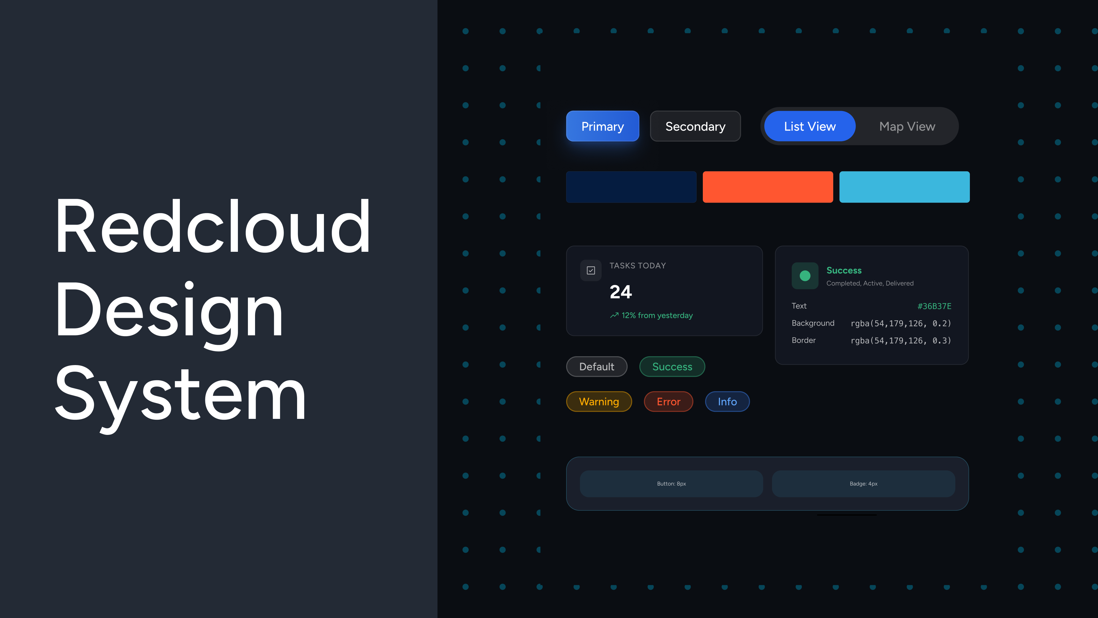
By early 2026, RedCloud faced a problem rooted in workflow, not aesthetics. Product managers had started prototyping on their own with AI tools — Lovable, Figma Make, Claude — and every output looked like it came from a different company.
The deeper concern wasn't visual inconsistency alone; it was perception. A stream of manager-led demos made it look like RedCloud had no design infrastructure at all.
“I'd join one meeting and see one product, join the next and see something completely different, with no shared visual language between them.”
In March 2026 the CTO put it plainly: “we need a universal design library so that everything we ship feels like it comes from one company, not four.” The spec was direct — use Claude, build the components in a single file, hand them to engineering. The method was left wide open.
Manager-led demos
PMs prototyped independently in Lovable, Figma Make and Claude — every demo looked like a different company.
No shared language
Nothing tied the outputs together, so leadership started to wonder whether the company even had designers.
A moving target
Claude's design capability was changing week to week — the method had to adapt in real time, with no precedent.
Ship to engineering
The ask was concrete: build components in a single file and hand them to engineering to consume directly.
Goal
Design and deliver a universal, token-driven library so everything RedCloud ships reads as one company — consumable by engineering without rework.
The order of operations mattered more than the components themselves. Three decisions set the foundation before a single button was drawn.
Leverage what exists
Phosphor icons and the existing Figma tokens — extend, don't rebuild.
Tokens before components
Every spacing value, radius, colour and state gets a named token first.
Rules before output
Strict naming, token hierarchy and constraints up front — without them an AI tool will happily generate inconsistent variants forever.
The components are the output of the rules. Set the rules first.
The substance of the project was the token architecture: 109 named tokens across spacing, radius, control heights, padding and semantic interaction states — every value named before anything was composed from it.
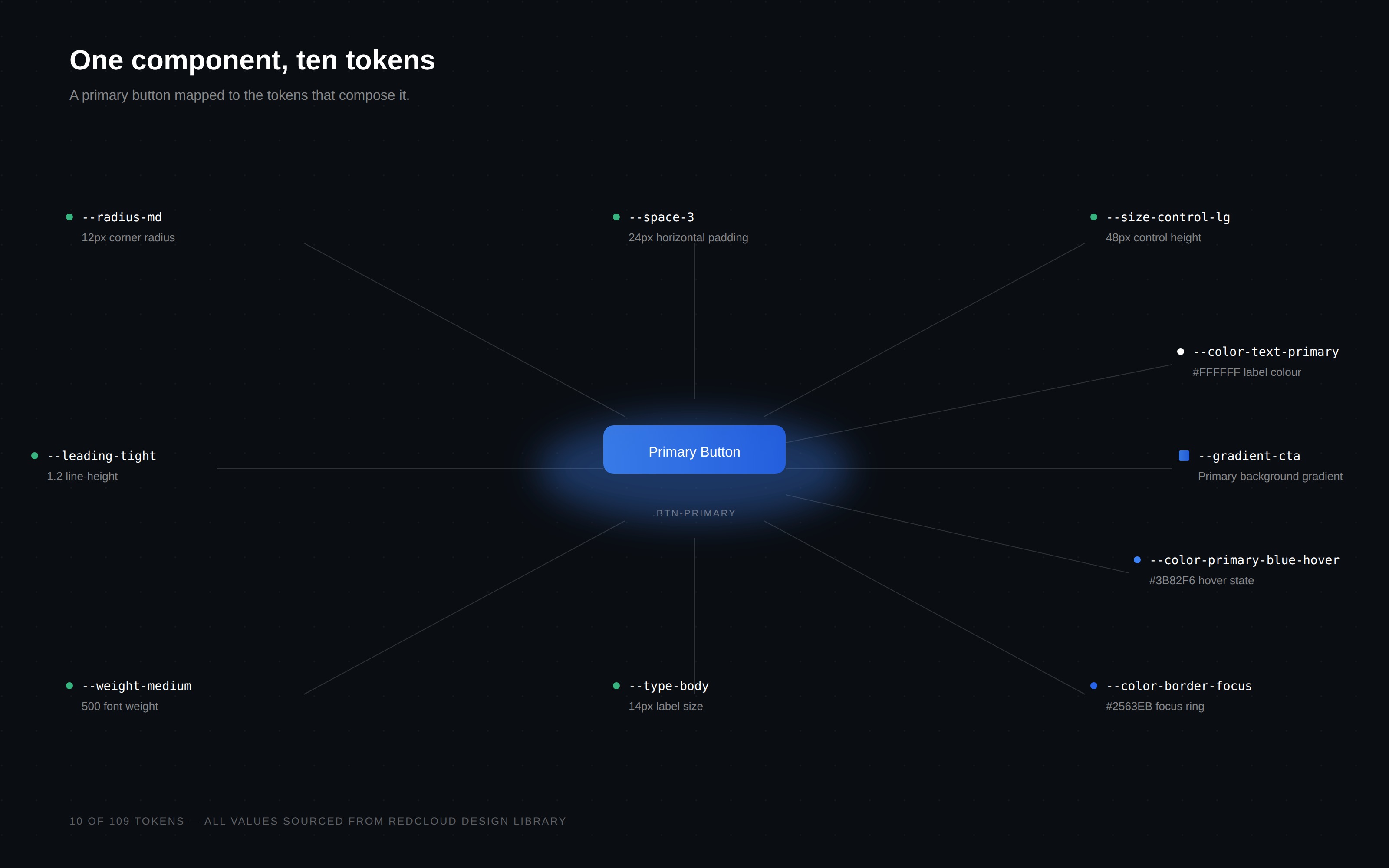
Colour tokens
Brand
Semantic
Surface
Shipped as tokens
Delivered as a single HTML file plus a JSON token file, committed straight into RedCloud's internal UI repo — structured for engineering's build pipeline to consume.
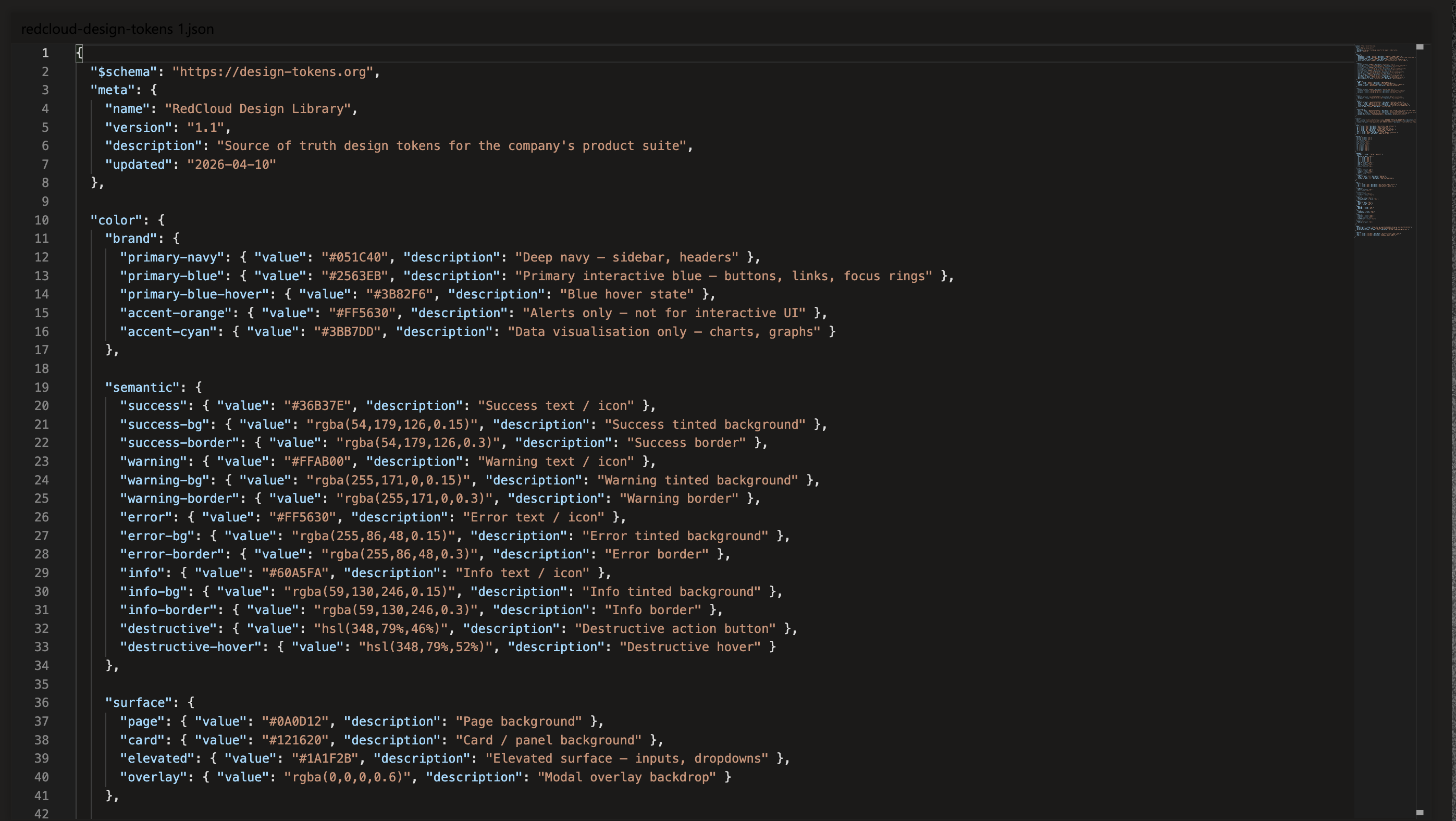
{
  "$schema": "https://design-tokens.org",
  "meta": { "name": "RedCloud Design Library", "version": "1.1" },
  "color": {
    "brand": {
      "primary-navy":       { "value": "#051C40" },
      "primary-blue":       { "value": "#2563EB" },
      "primary-blue-hover": { "value": "#3B82F6" },
      "accent-orange":      { "value": "#FF5630" },
      "accent-cyan":        { "value": "#3BB7DD" }
    },
    "semantic": {
      "success":     { "value": "#36B37E" },
      "warning":     { "value": "#FFAB00" },
      "error":       { "value": "#FF5630" },
      "info":        { "value": "#60A5FA" },
      "destructive": { "value": "hsl(348 79% 46%)" }
    }
  }
}
Nine core components
Buttons
Badges
Toggles & view switchers
Side navigation
Form elements
Modals & dialogs
Pagination
Tabs
Prompt fields
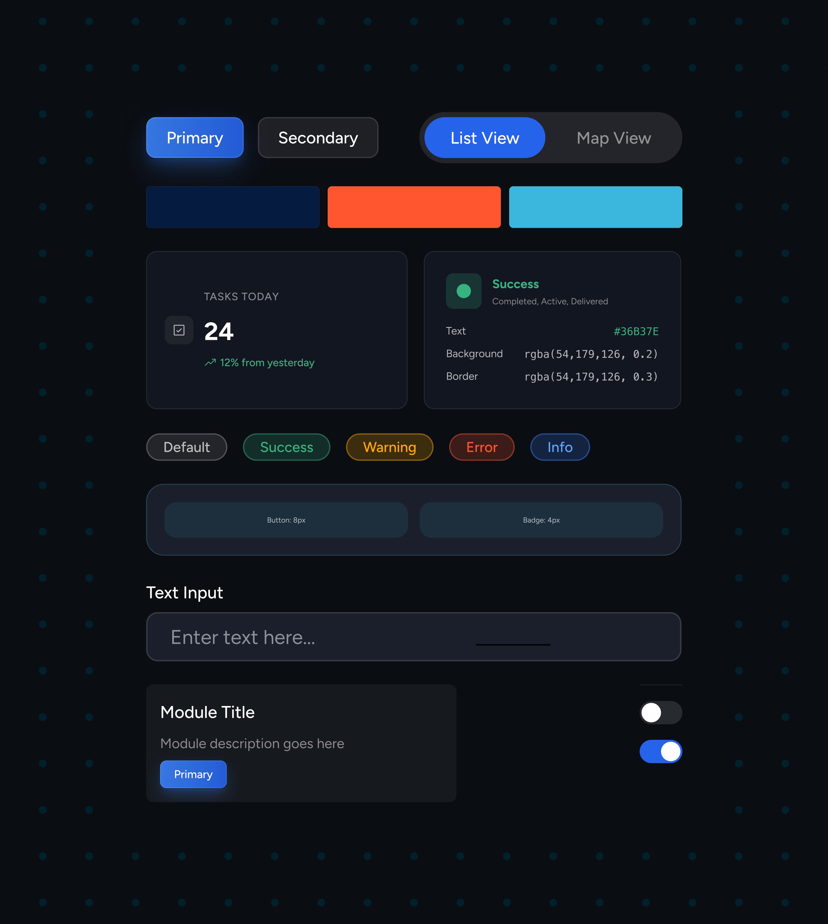
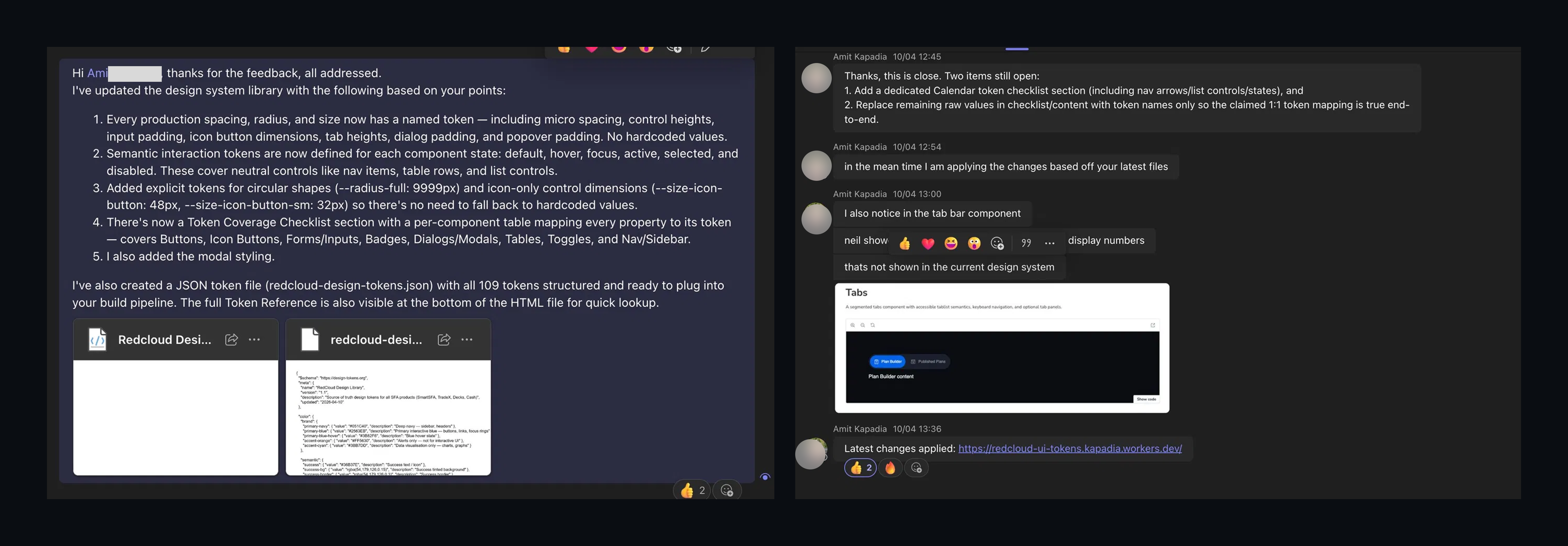
The most important phase came after delivery. Engineering reviewed the library against production criteria and pushed back across several rounds — reframing “done” from a design reference into infrastructure.
- Every spacing, radius and size mapped to a named token — no hardcoded values.
- Semantic interaction tokens for each state: default, hover, focus, active, selected, disabled.
- Explicit tokens for circular shapes and icon-only control dimensions.
- A per-component coverage checklist mapping every property to its token.
- End-to-end, 1:1 token-mapping verification.
“A design system isn't accepted when designers say it's done. It's accepted when engineering can consume it without modification.”
9
Core components
40+
Variants & states
109
Named tokens
4
Product platforms
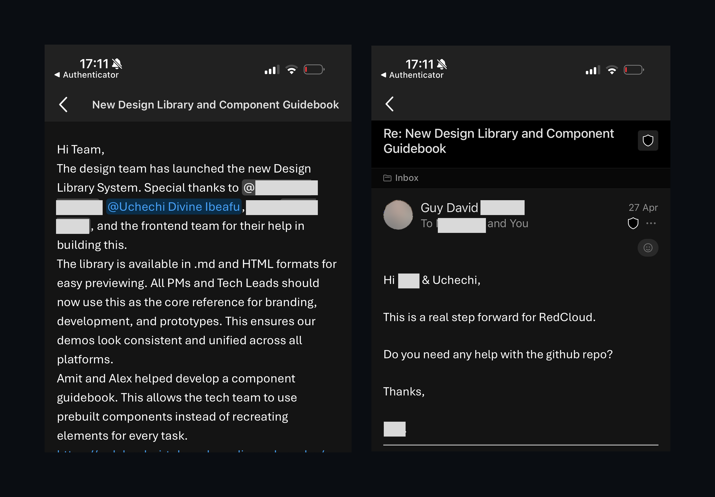
The library became the source of truth for branding, development and prototyping across four internal platforms — adopted by four PMs and eight engineers. Migrations that read as guesswork became a shared reference.
Behavioural shift
PMs now ask for design review before they ship — the relationship moved from “can you fix this?” to “does this align?”.
Think in systems, not screens
When anyone can generate a screen in seconds, the value moves upstream — to the rules, token hierarchy and naming that keep it all coherent.
“Done” is engineering's call
A design system isn't accepted when the designer says it's finished. It's accepted when engineering can consume it without modification.
The review was the work
Iterating to production standards wasn't friction on top of the project — it was the project.
This is the first production version, not a finished product — nine components are a starting point. Phase two goes deeper: broader component coverage, richer semantic patterns and more product surfaces.
Designing a Communication Architecture (ANS)