Context
By early 2026, RedCloud had a problem that wasn't really about design.
A wave of PM-led prototyping was running across the company. Every PM with an idea was now able to spin up a demo themselves, in Lovable, Figma Make, sometimes Claude. Some were polished, some weren't. Each one looked like it came from a different company. I'd join one meeting and see one product, join the next and see something completely different, with no shared visual language between them.
The deeper issue wasn't the inconsistency itself. It was what the inconsistency implied. With so many demos going out, it had started to feel, internally and externally, like the company didn't have designers. The design team's work was being eclipsed by a workflow where anyone could ship something that looked like a product.
I was watching this from a specific position: I'd already been using Claude in my own time, building components and exploring what AI-assisted design looked like done with discipline. So I could see the gap between what was possible and what was being shipped as demos. Most PMs couldn't.
In March 2026, the CTO called a meeting. The brief was direct: we need a universal design library so that everything we ship feels like it comes from one company, not four. The instruction was specific: use Claude (the company already had it paid for), build components in an .md file, hand it to engineering. That was the spec.
How to actually do it was open.
The setup
I worked with the other designer on the team to scope what "a design library in Claude" actually meant. The CTO's brief was the goal; the method was ours to figure out.
The first decision was to leverage what already existed. We had a Figma design system with established tokens, type scales, colour palettes, input field styling. There was no value in rebuilding any of that. So the work became a translation: take what existed in Figma, plus what we needed for the four internal product platforms the company was building, and turn it into a Claude-built HTML library that engineers could actually consume.
We made a few decisions early that turned out to matter more than we expected:
- Use existing where it exists. Phosphor icons rather than building an icon set. Our Figma tokens rather than re-deriving them. The library should add structure, not duplicate work.
- Tokens before components. Every spacing value, radius, colour, and state needed a named token before any component used it. No hardcoded values anywhere.
- Rules before output. Designing a system in Claude means setting strict rules up front, naming conventions, token hierarchy, what to use when, because without that discipline an AI tool will happily generate inconsistent variants forever. The rules turned out to be as much of the work as the components themselves.
The second important constraint, and one we couldn't plan around: Claude was rolling out new design features during the period we were building. There was no existing methodology for how to do this. We were figuring out how to design a production-grade system in a tool whose capabilities were changing under us week by week.
The work
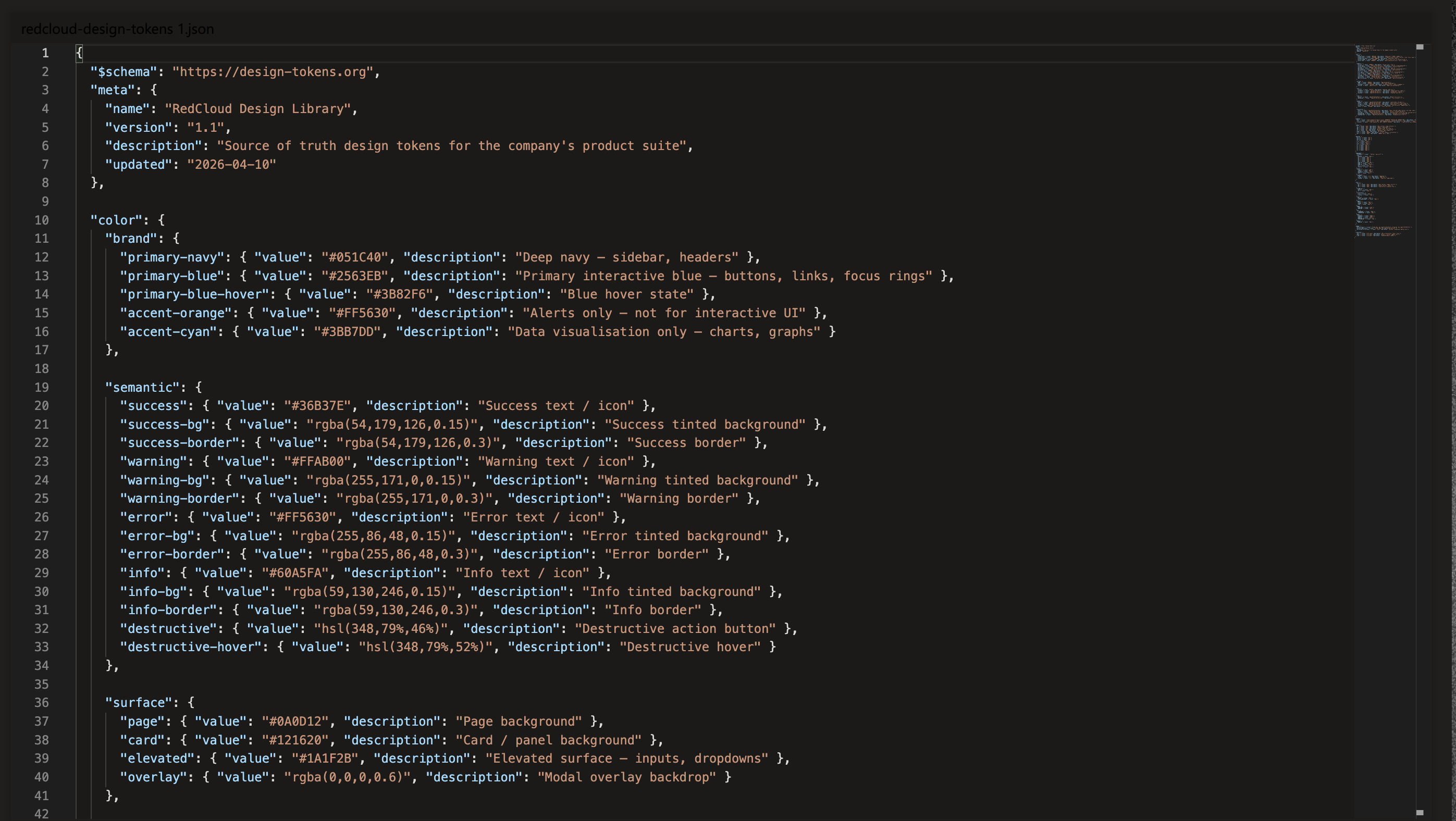
The library shipped as a single HTML file plus an accompanying JSON token file, committed to an internal RedCloud UI repo any engineer could pull from.
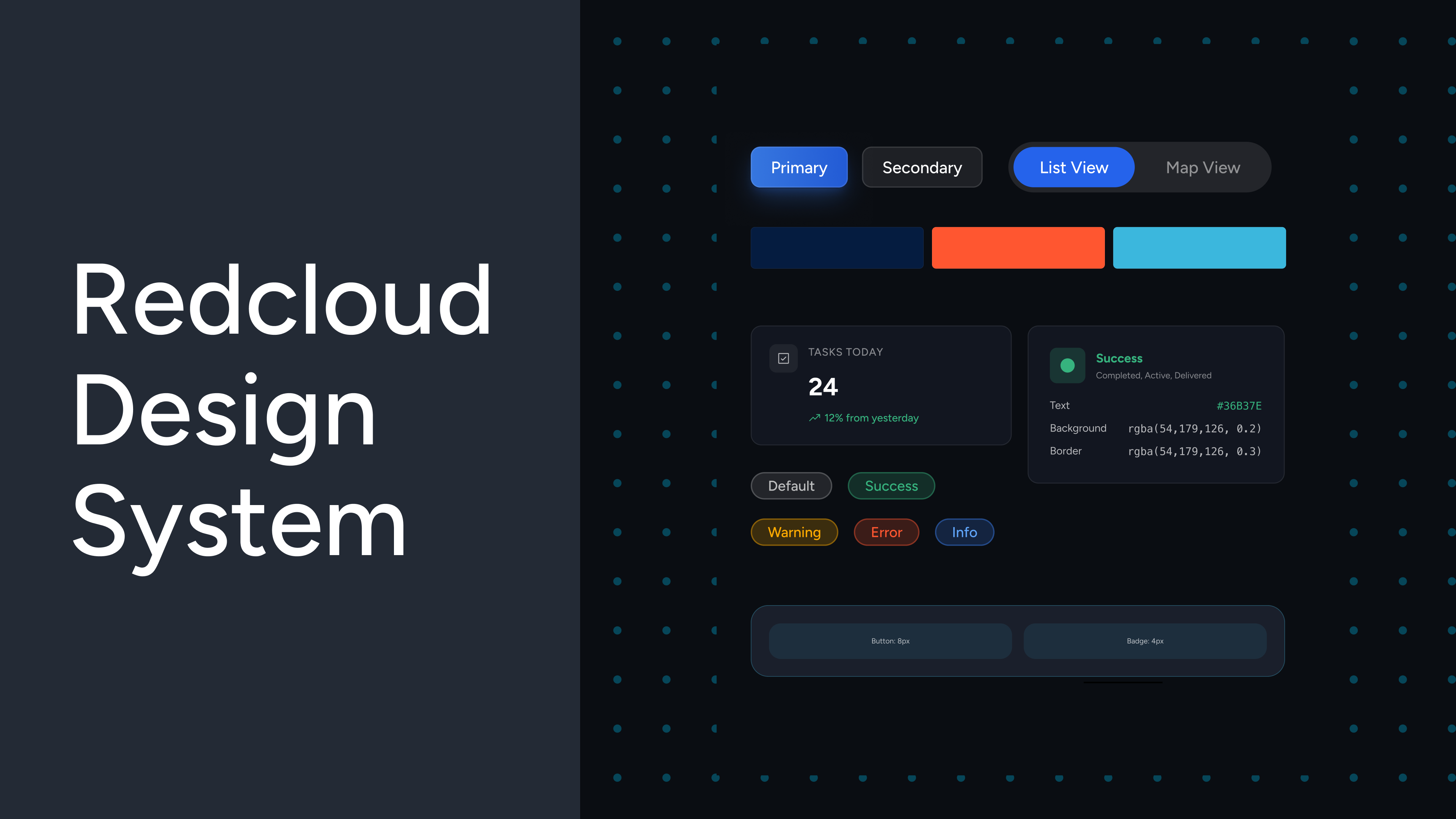
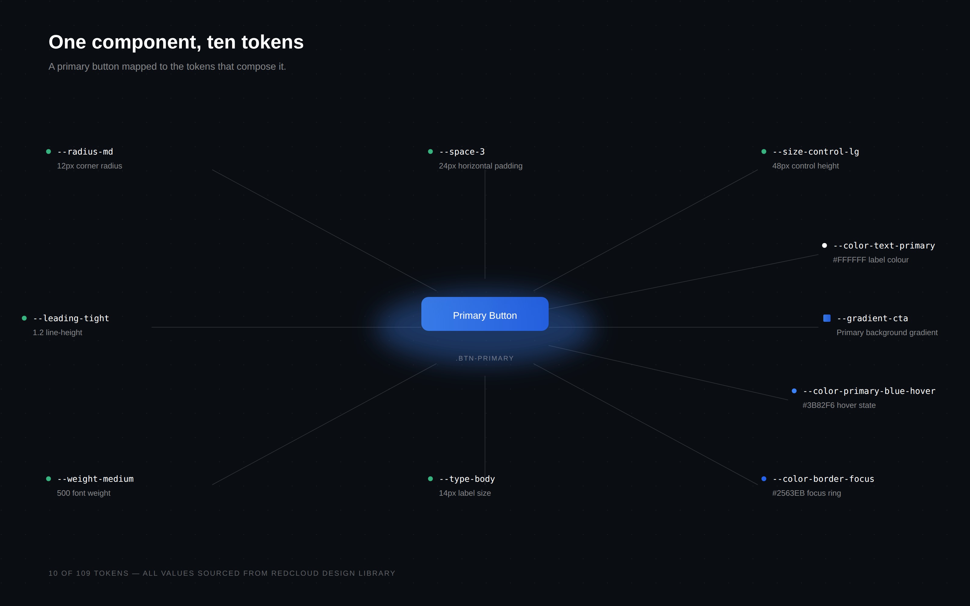
It covered nine core components: buttons, badges, toggles and view switchers, side navigation, form elements, modals and dialogs, pagination, tabs, and prompt fields. Across those nine components sat 40+ distinct variants and states, all derived from a structured token system underneath.
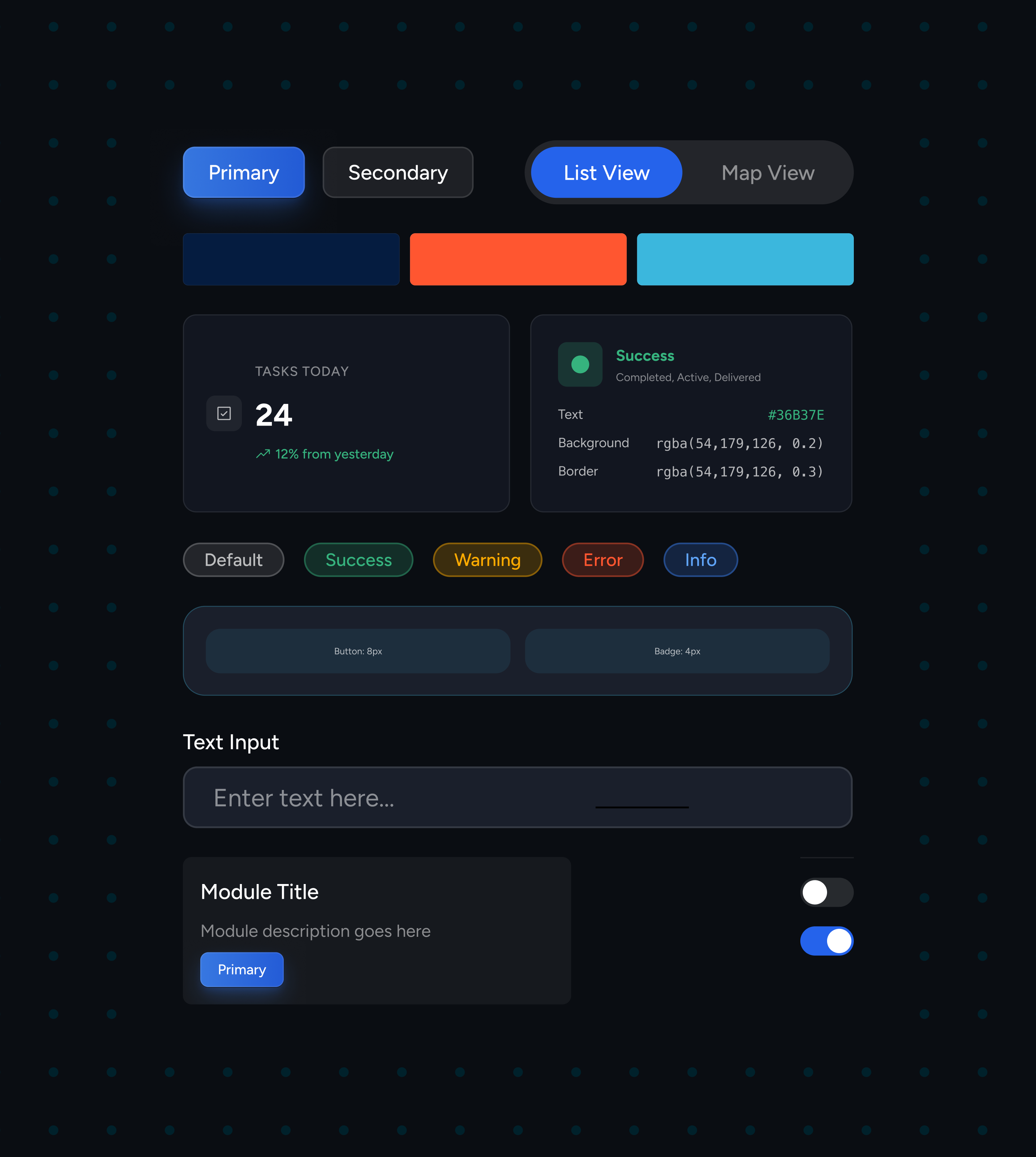
The token system itself ended up doing more work than the components. By the time the library shipped its production version, it contained 109 named tokens, every spacing value, radius, control height, padding measurement, state colour, semantic interaction state, mapped to a token name and ready to be consumed by engineering's build pipeline as JSON.
We made an internal announcement when the library went live. The CTO replied directly:
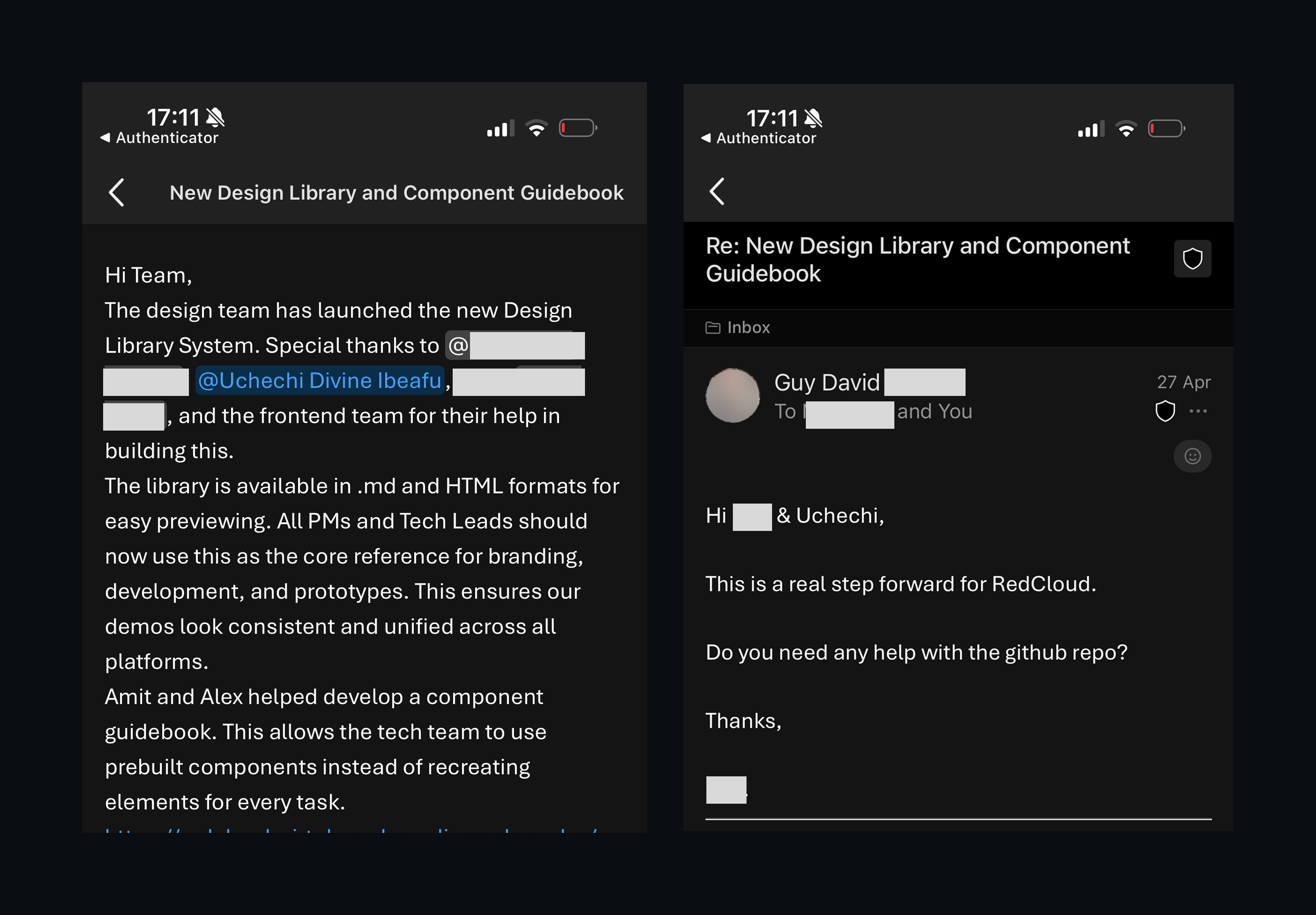
That message mattered, not because of the praise, but because it confirmed the work landed where it was meant to: leadership recognised the library as infrastructure, not as decoration.
Where it got real: engineering review
The work I'm proudest of in this project isn't the first version of the library. It's what happened after.
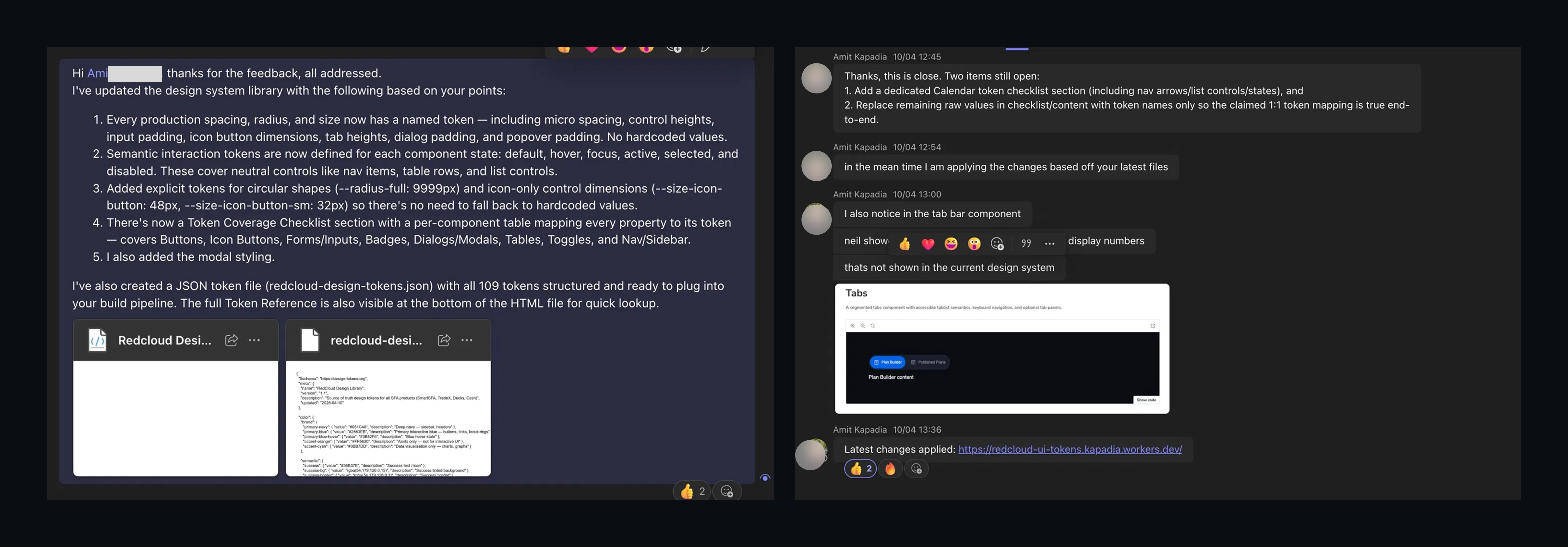
Engineering didn't accept the library on first delivery. The lead engineer reviewing the work pushed back across multiple rounds with detailed, production-quality criteria:
- Every production spacing, radius, and size needs a named token, no hardcoded values.
- Semantic interaction tokens need to be defined for each component state: default, hover, focus, active, selected, disabled.
- Explicit tokens needed for circular shapes and icon-only control dimensions, so the build pipeline never falls back to hardcoded values.
- A token coverage checklist with a per-component table mapping every property to its token.
- The 1:1 token mapping needed to be true end-to-end, no remaining raw values anywhere in the checklist or content.
Each round, I closed the gaps and resubmitted. Five items in one round, two more in the next, then a final detail about Tab Bar coverage that wasn't in the spec but engineering wanted documented.
What that review process did, quietly, was redefine what "done" meant. The original brief was a style guide for PMs. By the time engineering signed off, the deliverable had evolved into a production-grade token system with a JSON file ready to plug into the build pipeline. That shift, from design reference to production artefact, was the most important thing that happened in the project, and it didn't happen until engineering pushed for it.
I treated that pushback as the bar, not as resistance. A design system that only designers approve of isn't a design system, it's a moodboard. The library shipped its first production version only when engineering confirmed every property mapped to a named token and the latest changes had been applied to the build.
Results
| Metric | Outcome |
|---|---|
| Components | 9 core, 40+ variants and states |
| Tokens | 109 named tokens, JSON-ready |
| Adoption | 4 internal product platforms, 4 PMs, 8 engineers |
| Status | Source of truth for branding, development, and prototyping across the org |
Beyond the numbers, the working dynamic shifted. PMs now send work to the design team for review before shipping. The question has changed from "design, can you fix this?" to "design, does this align?" That's a different relationship, and it's the one a design system is actually meant to produce: design as a function that gives the rest of the org leverage rather than one that reacts to their output.
Still building
It's worth being honest about what this case study is documenting: a first production version, not a finished product. Nine components is a starting point, not an end state. Design systems don't finish; they grow as new patterns surface, as new platforms get built, as the underlying tools (Claude included) evolve their own capabilities. The library covers the patterns the company needed in early 2026. The Phase 2 work, deeper component coverage, more semantic patterns, integration into more product surfaces, is ongoing.
That's the point, actually. A design system that's "done" is one that's stopped serving the team using it.
What I took with me
The lesson that surprised me most: designing with AI rewards designers who think in systems, not screens.
When the tool can generate visual output in seconds, the value of a designer doesn't go down, it shifts up the stack. The rules, the token hierarchy, the naming conventions, the constraints that prevent inconsistency, those are the design work now. The components are the output of the rules. If you don't set the rules up front, AI will happily generate a library that looks fine and falls apart in production.
The other lesson, harder won: a design system isn't accepted when designers say it's done. It's accepted when engineering can consume it without modification. The original brief asked for a style guide. The real bar was a production-ready token system. The difference between those two artefacts is the difference between design as recommendation and design as infrastructure. Iterating to meet the higher bar wasn't friction, it was the work.
Internal infrastructure, not publicly available.