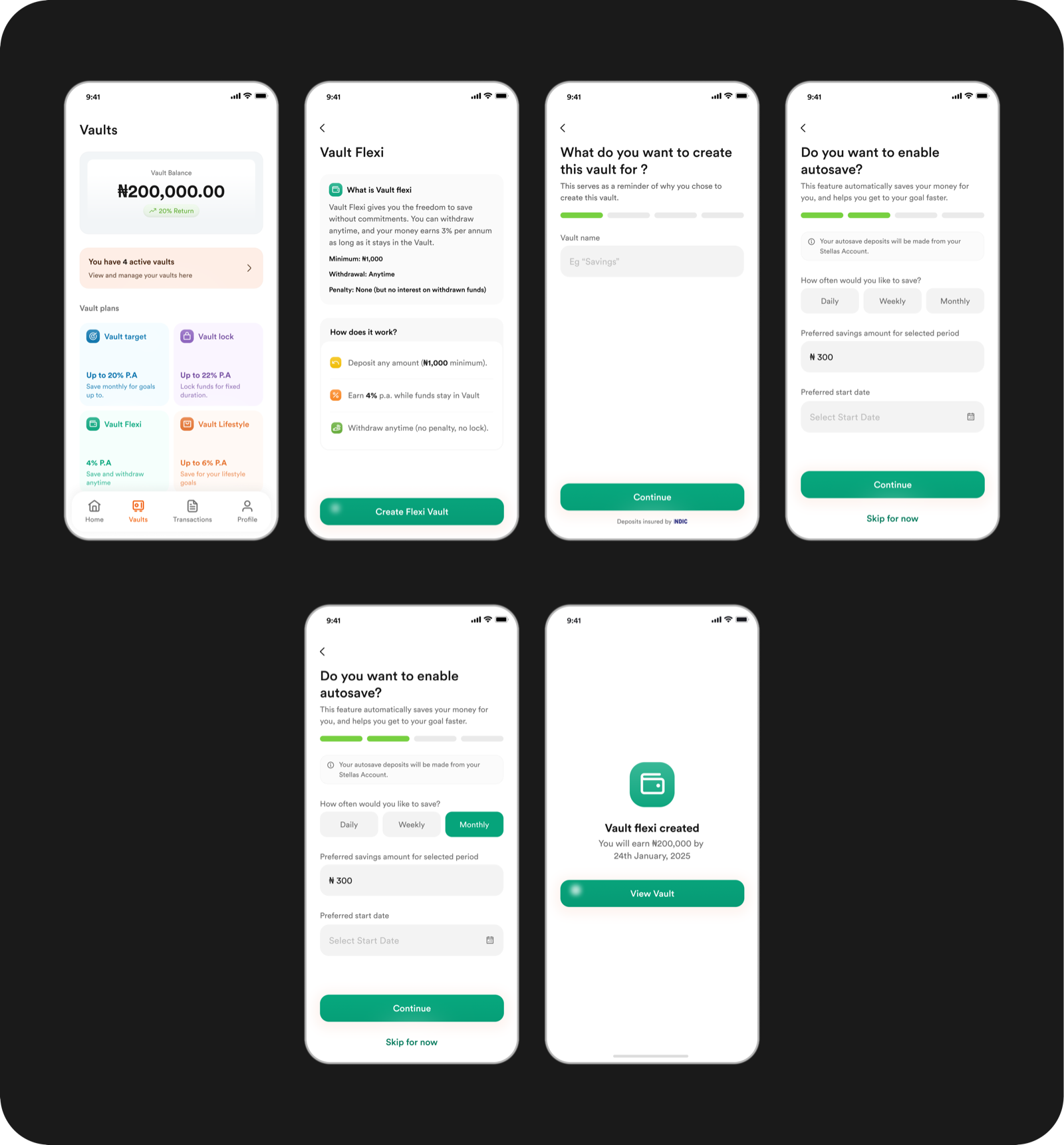
Context
Stellas is a Nigerian digital challenger bank. I led the redesign of the product end-to-end, and Transfer was one of the first flows that came out of that work.
After the redesign shipped and the product was in market, a pattern started showing up in the data and in every customer conversation.
Users received their salary or income on Stellas. Then they moved it out.
Most of it went to PiggyVest, Cowrywise, and other Nigerian fintechs — platforms where users could actually save, grow, and plan with their money. Stellas had cards, transfers, and account management. It didn't have anywhere for money to live.
The strategic problem wasn't a design problem. It was a product problem: Stellas was becoming a transit account, not a bank. Users had no reason to keep money on-platform beyond spending, and the business needed the opposite — a home for deposits, a reason for users to stay, and a proposition that competed with the savings-native fintechs pulling money off the platform.
The question we were now solving was: how do users think about their money, and what shape does saving actually take for them?
The strategic bet
This wasn't a solo design decision. It was a three-way conversation between design, product, and business. My role was to shape the design direction, but the tier structure itself was a joint call, informed by market context and business strategy.
We started by looking at the market. PiggyVest, Nigeria's largest savings fintech, had done more than build a product. It had built a savings culture. Young Nigerians didn't save money in one way. They saved for specific goals, locked money away as a commitment device, put money aside for lifestyle purchases, or held on-platform storage they could access anytime. Multiple tiers had become the market expectation.
We didn't need formal user research to validate this. Almost every young earner in Nigeria uses PiggyVest — including me and everyone I know. The behaviour was already visible in every conversation about money, and I was routinely moving my own salary off Stellas to save it elsewhere. The users were us. The problem was ours. Casual conversations with peers only confirmed what was already obvious: people saved differently depending on why they were saving. A trip abroad, a laptop, a house rent, a business float, an emergency fund. All of these had different behavioural shapes — different urgency, different discipline, different tolerance for locking money away.
That gave us the strategic frame for Vault. Savings on Stellas couldn't be one product. It had to reflect how users already thought about their money.
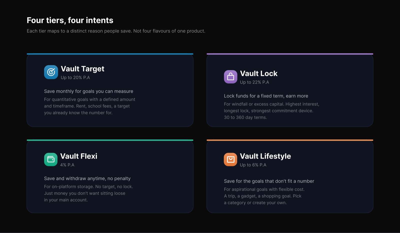
We landed on four tiers:
Vault Target — for quantitative goals. You know the amount you're saving for, like ₦2M for rent or ₦500K for school fees. Stellas engineers a plan: how much you need to put away each day or month to hit the target in your chosen timeframe.
Vault Lifestyle — for aspirational goals. You're saving for something specific but flexible in cost, like a trip, a gadget, a shopping goal. Choose a category or create your own, set your target, and get a plan.
Vault Flexi — for on-platform storage. You just don't want the money sitting in your main account, but you're not committing to a duration or a goal. Save anytime, withdraw anytime, no penalty, low interest.
Vault Lock — for windfall or excess capital. You've come into a larger sum — maybe from a deal, a business payout, or accumulated savings — and you want it to grow instead of sit still. Lock it for a fixed term (30, 60, 90, 180 days, up to a year) and earn a stronger interest rate in exchange for giving up access.
The design tension
Four tiers gave us the product architecture we needed, but it created a real design problem.
The moment a user opens Vault, they see four options. If the difference between them isn't obvious, the whole proposition falls apart. A user who doesn't understand why they'd pick Lock over Target won't pick either. They'll close the tab and go back to PiggyVest, where they already know what to do.
Choice without clarity is worse than no choice at all.
The load-bearing decision was how to make the four tiers feel distinct and legible without making the user work to understand them. My call: descriptive by default. Nothing important should be hidden behind a tap.
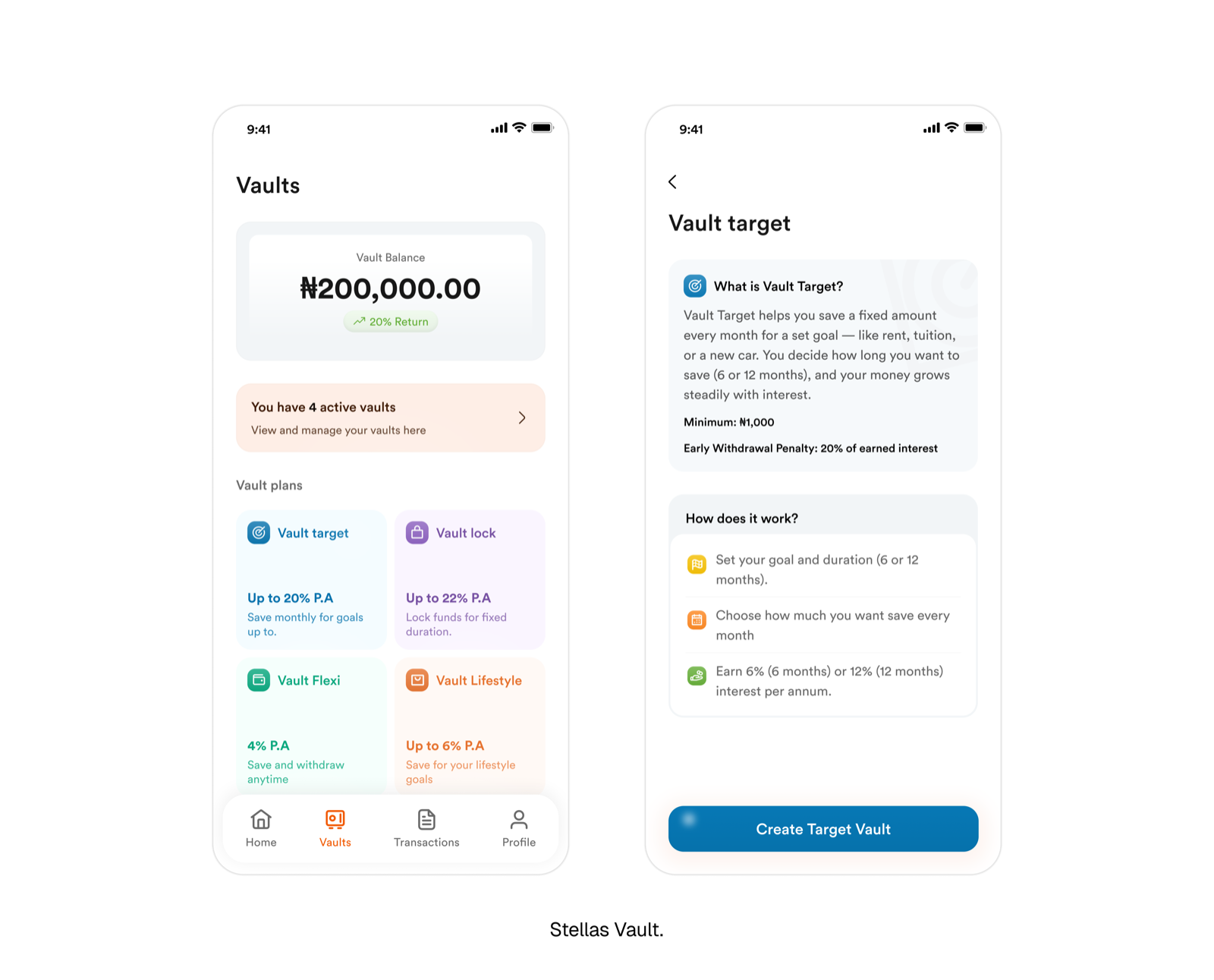
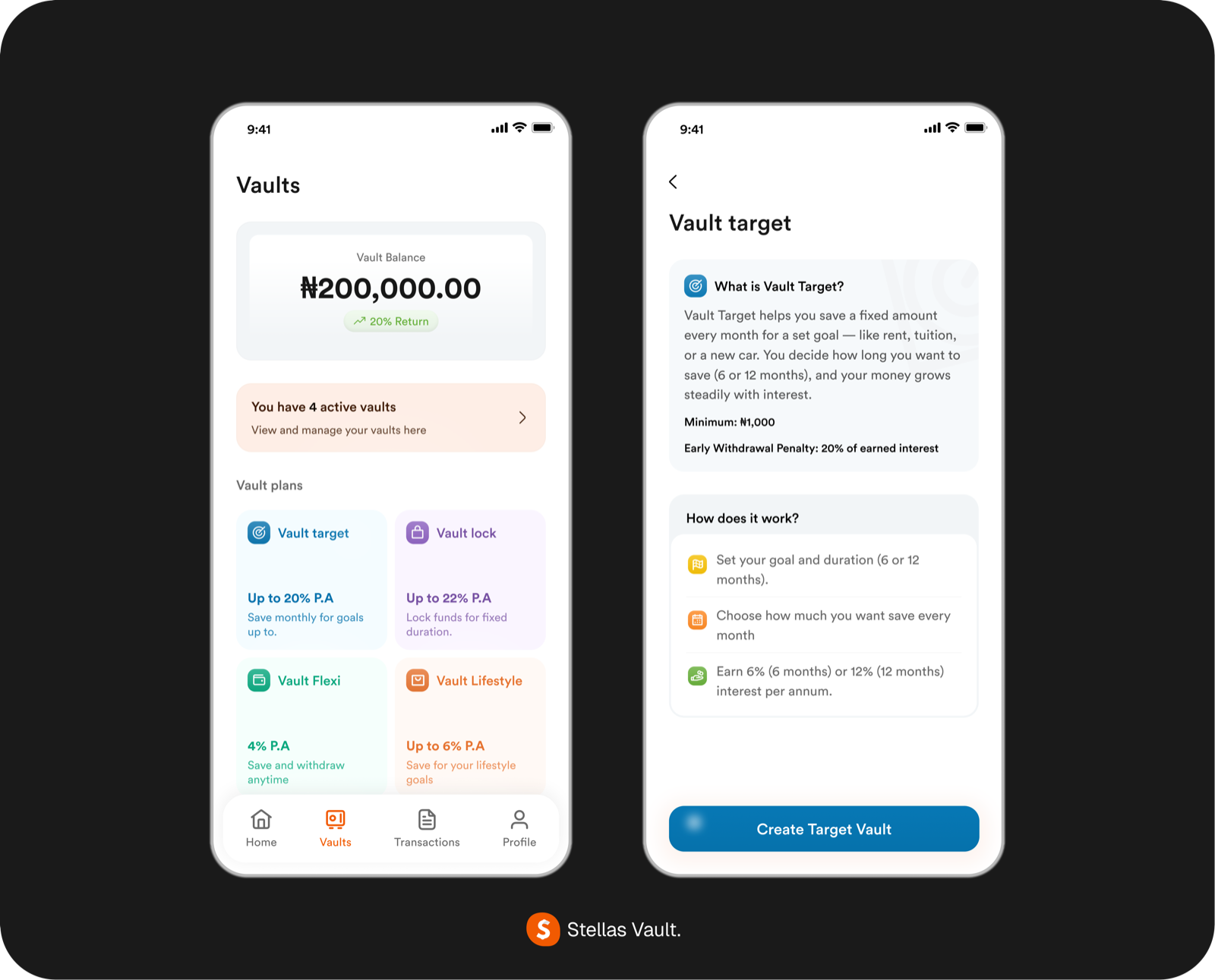
On the Vault dashboard, every tier card carries its own short description. Not just a name. Not just an interest rate. A one-line explanation of what the tier is for and who it's for. "Save monthly for goals" sits on Target. "Lock funds for fixed duration" sits on Lock. "Save and withdraw anytime" sits on Flexi. "Save for your lifestyle goals" sits on Lifestyle. The user can compare tiers at a glance without opening anything.
On the tier detail pages, before a user can commit, they see a longer explainer: what the tier does, how it works, the interest rate, the duration options, the penalties (if any), and a concrete example of what saving in this tier looks like in practice. Only after that does the CTA appear.
The pattern held across every tier: explain first, act second. The dashboard was a menu, not a decision. The detail page was where the decision happened, with all the information the user needed to make it well.
What shipped
Vault launched as a four-tier savings product inside the Stellas app.
The dashboard is the entry point. Users see their total Vault balance at the top, followed by an active vaults summary if they have any, and the four tier cards below. Each card carries the tier name, an icon, the interest rate ("Up to 20% P.A", "Up to 22% P.A", "4% P.A", "Up to 6% P.A"), and its one-line description. Colour distinguishes the tiers at a glance: blue for Target, purple for Lock, green for Flexi, orange for Lifestyle. The same colour system carries through into the tier detail pages and into every screen inside that flow, so a user in Vault Lock always knows they're in Vault Lock.
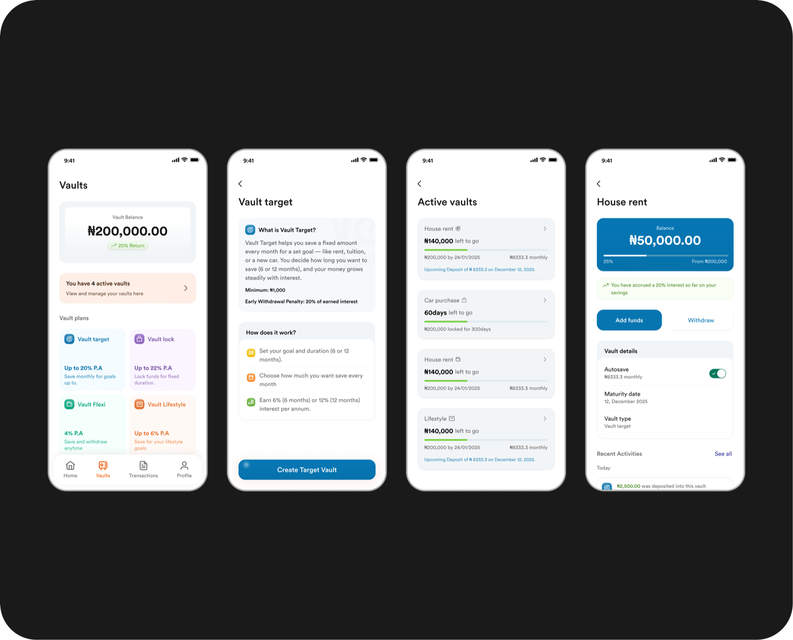
Tapping into a tier opens the explainer view. The user sees how the tier works, the interest rates, the durations available (where relevant), the penalty structure (where relevant), and how the tier compares to the others. Only once the user has read past this does the "Start saving" CTA appear.
The save flow is consistent across all four tiers to keep the mental model simple. Set the amount, choose the source account, review the details in a confirmation step, complete. What varies between tiers is the configuration step, where the user makes tier-specific choices: a target amount and duration for Target and Lifestyle, a lock duration for Lock, nothing at all for Flexi.
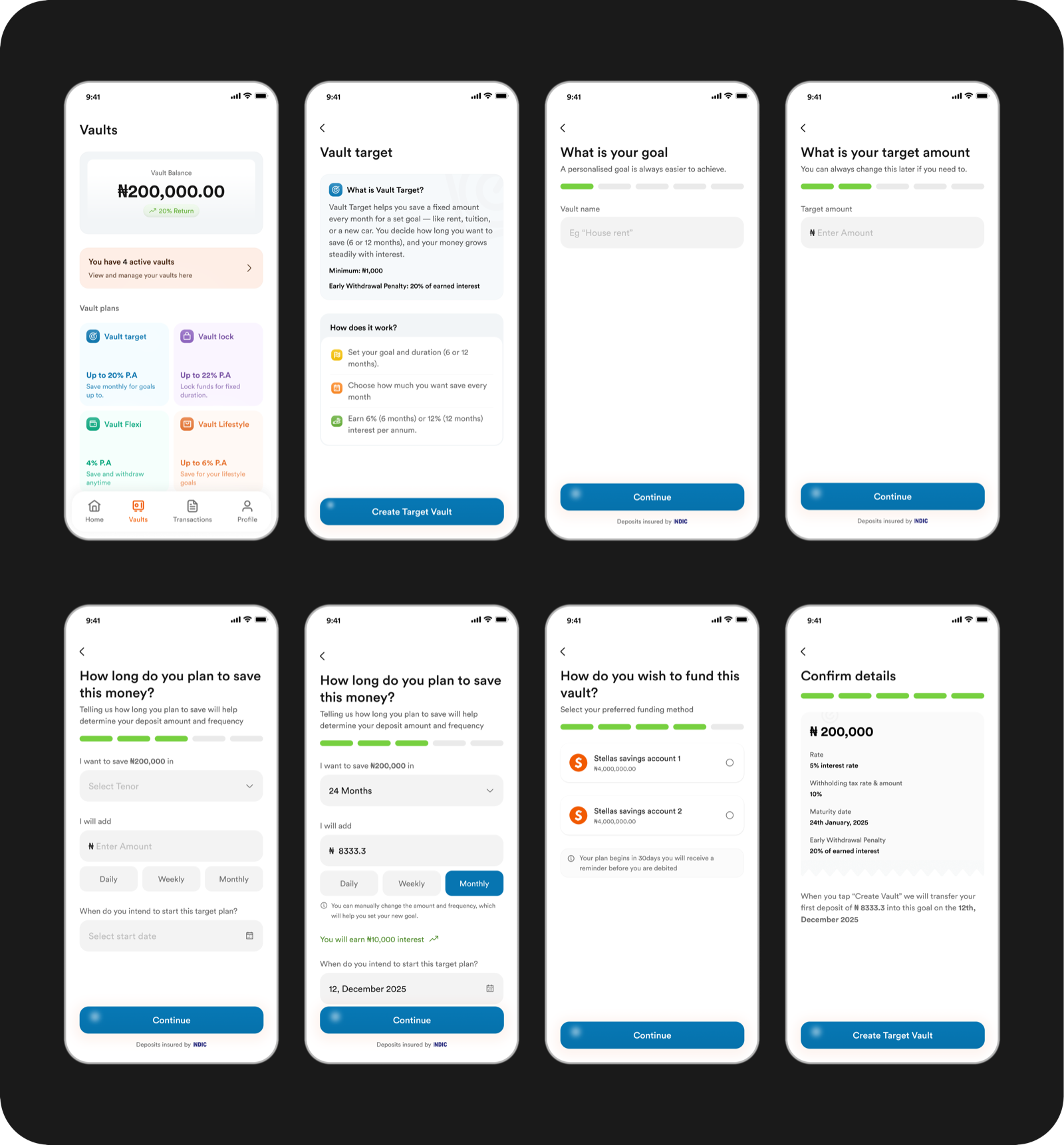
The visual language is deliberately calm. White background, dark type, clean icons, and clear semantic colour usage (green for success, red for warnings, tier colours for identity). No decoration for its own sake. Every visual choice earns its place by clarifying the product for the user.
What I'd measure next
Vault launched about a month before I left Stellas, which means I don't have adoption data to report. But the way I'd measure whether the four-tier bet worked was built into the design from the start, and it's the part I'd want to hand off to whoever picks it up.
The load-bearing question is whether users pick the tier that matches their goal, or whether they default to whichever tier promises the highest interest regardless of fit. That's the question the whole intent-based architecture rises or falls on.
Four things I'd want to understand in the first three to six months post-launch:
Tier selection distribution. How does saving split across the four tiers? If Lock captures most of the volume because users chase the higher rate, the intent frame didn't hold. If the distribution reflects the four different behaviours we designed for, it did.
Deposit patterns per tier. Lock should skew toward larger, less frequent deposits. Target and Lifestyle should show consistent recurring contributions. Flexi should show smaller, higher-frequency movement. If those shapes show up, the tiers are matching real behaviour.
Withdrawal behaviour on Flexi. Flexi is designed for on-platform storage without commitment. If withdrawal frequency is high enough that users treat it as a second current account, we've built the wrong product for that tier and need to reposition it.
Early withdrawals on Lock. Lock rewards duration but requires trust. Frequent early withdrawals — penalty accepted — would signal either a trust problem or a mispositioning of what Lock is for.
Beyond the quantitative side, the qualitative work matters just as much. Talking to actual users about which tier they picked and why, whether the tier descriptions read the way we intended, whether the split by intent actually mapped to how they think about saving — or whether the four-tier framing was closer to how we saw the market than how they do. Design decisions this structural should be pressure-tested against real users, not just data.
The tiers were designed to be legible enough to measure and specific enough to research. That was a deliberate call, so the follow-up team could actually read the results cleanly — whether the answer was "we got it right" or "we misread the market."
Lesson
Savings isn't one product. It's four.
That was the strategic bet Vault was built on: users don't optimise for interest rate, they optimise for the shape of their goal. A product architecture that maps to intent will outperform one that maps to access mechanics.
The bigger lesson underneath that — and the one I've carried into other work — is that product architecture is a design decision. Not a product manager's decision that a designer then styles. Not an engineering decision that a designer then decorates. The structure of what you're offering to a user — how many things it is, how they relate to each other, why each one exists — is a design problem, and it's the highest-leverage one you get to solve.
The screens matter. The flows matter. But whether the product exists in the right shape at all is upstream of both. Getting that shape right, or wrong, decides whether the design work that follows is going to succeed or just look good.
Vault was the first time I got to design at that level of the stack at Stellas. It's the work I'd most want to do more of.