Context
Stellas is a digital challenger bank built for Nigerians at home and in the UK, one of the few fintech products where a single 'send money' action can mean rent, school fees, or a parent's hospital bill. The stakes for getting transfer right weren't abstract. A failed transfer wasn't a feature bug; it was a cousin not paid on time.
Before the redesign, the transfer flow had a 75% transaction success rate (one in four transfers didn't complete cleanly), and 40% of users reported dissatisfaction with the feature in our surveys. Support tickets were dominated by reversal requests and 'where is my money' confusion.
I led product design on a ten-person cross-functional team: two backend engineers, a mobile developer, DevOps, QA, product owner, product manager, data analyst, and marketing, with me owning the end-to-end design of the flow.
The research
Before touching pixels
I combined three inputs: the analytics funnel, a mixed research pool of 30 active users across interviews and surveys, and a read-through of the last 90 days of support tickets alongside the Customer Support team.
Three patterns kept repeating:
- Users hesitated on the amount entry step, not the recipient selection
- Errors clustered at the confirm screen, not earlier in the flow
- Trust eroded when the numeric keypad felt 'generic'; users wanted affirmation that a bank was a bank
I'm not trying to be fast with this. I'm trying to be right. I type the amount, delete it, type it again. You can't undo sending money wrong.
That gave us a specific design target: make amount entry feel deliberate, unhurried, and bank-grade. Not faster. Slower in the right places.
The first attempt
The slider
My initial solve was a slider-based amount picker with preset values (₦10k, ₦20k, ₦30k, ₦40k…) and a double-tap-to-edit fallback for custom amounts. The theory was legitimate: a slider forces a physical gesture tied to the value, which should make a user feel the number rather than just type it, reducing the 'I meant ₦10,000, not ₦100,000' class of mistake. Presets would also speed up the most common transfer sizes.
Alongside the input, I set explicit targets with the PM before we shipped: lift the transaction success rate from 75% to 90%, and drop the dissatisfaction rate from 40% to below 10%.
We shipped the slider in 2021.
What actually happened
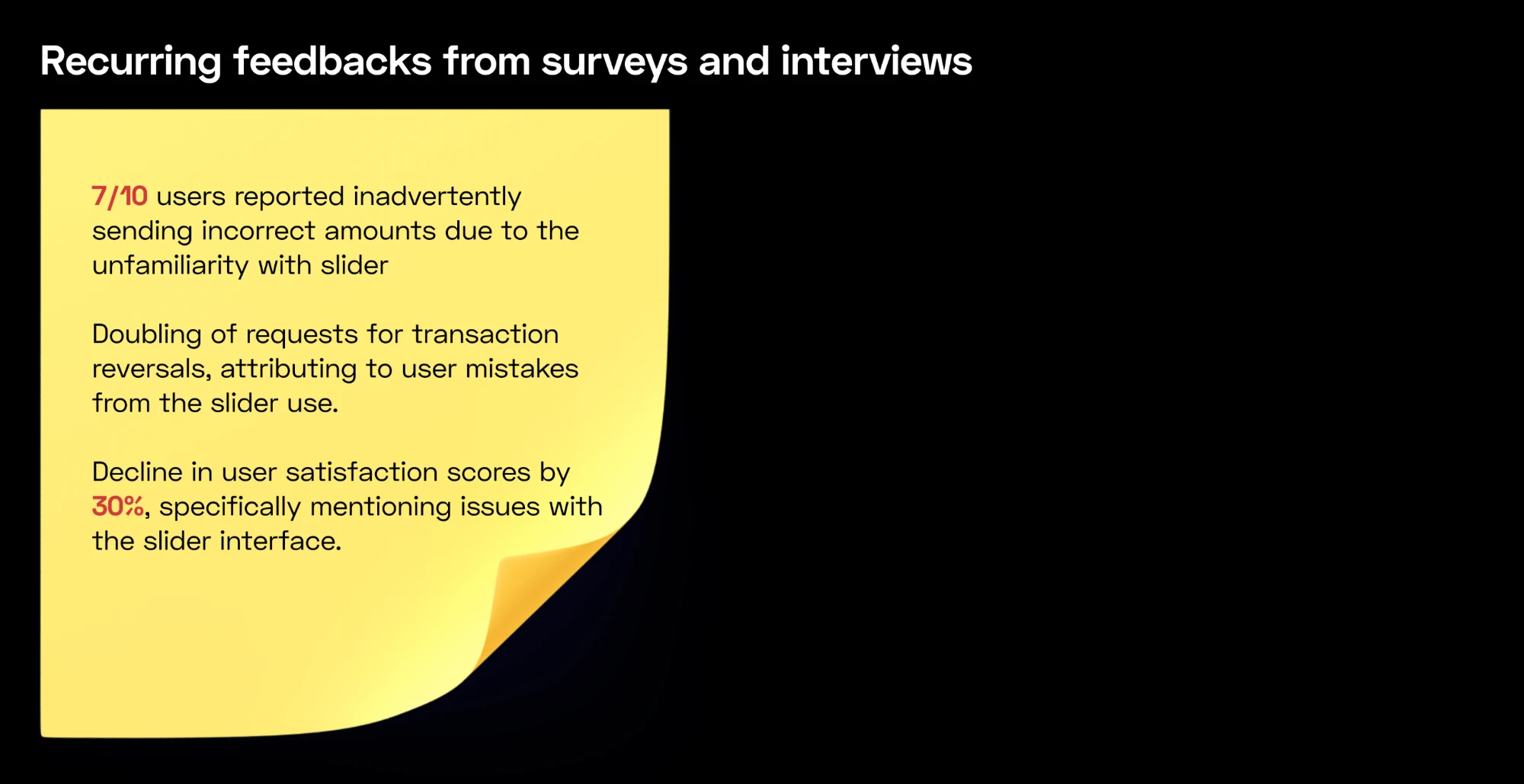
The honest part: it failed
Two weeks after rollout, the data came back brutal:
I had mistaken novelty for deliberateness. The slider made users feel like they were making a decision, but it gave them a control that was less precise than a keypad, in a context (money) where precision matters more than anything. The gesture I was trying to create, a pause before sending, turned into a guess.
It's not a comfortable part to show in a portfolio. But it's the one I learned most from: the difference between a design decision that feels smart and a design decision that actually protects the user.
The redesign
Inverting the hierarchy
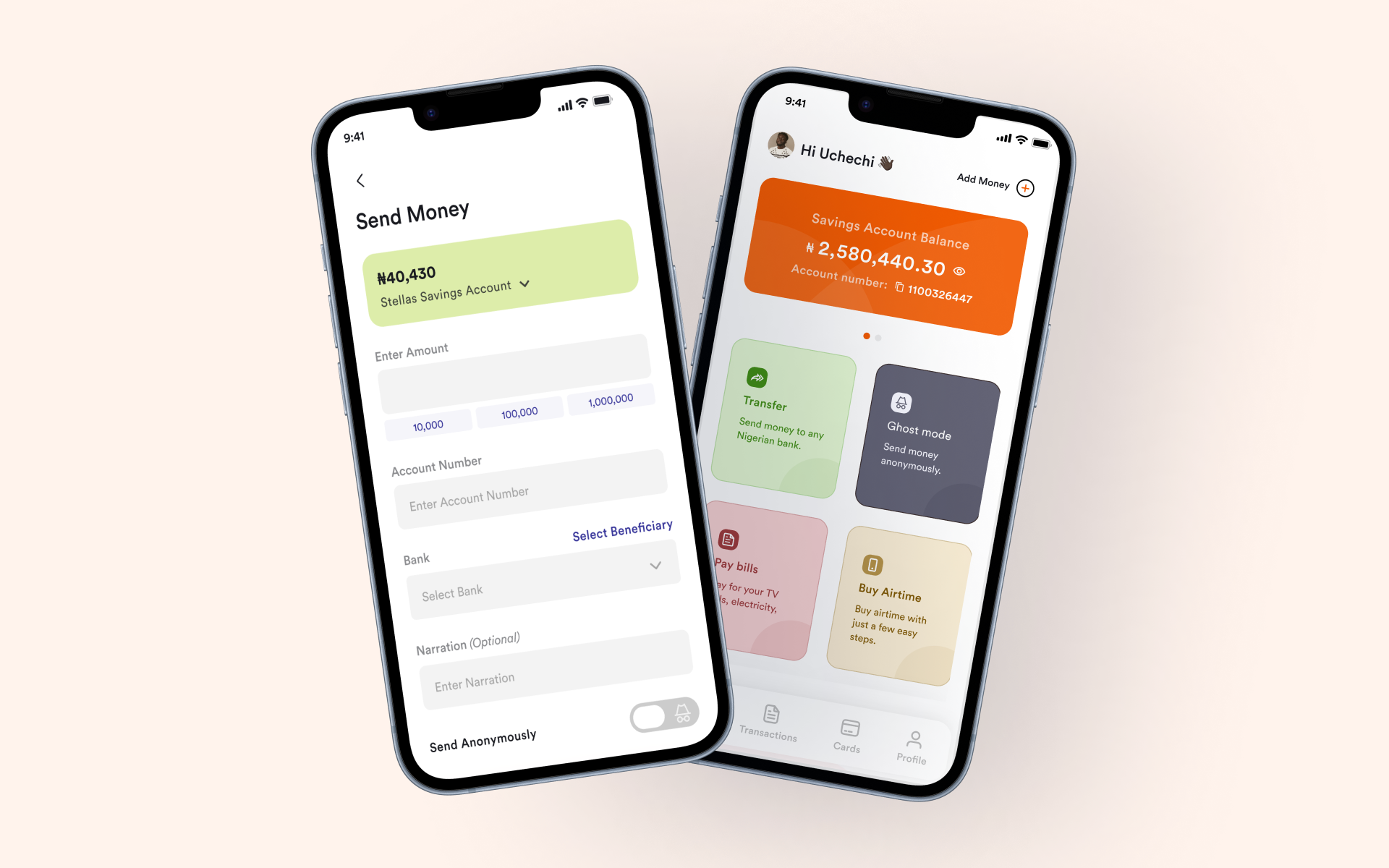
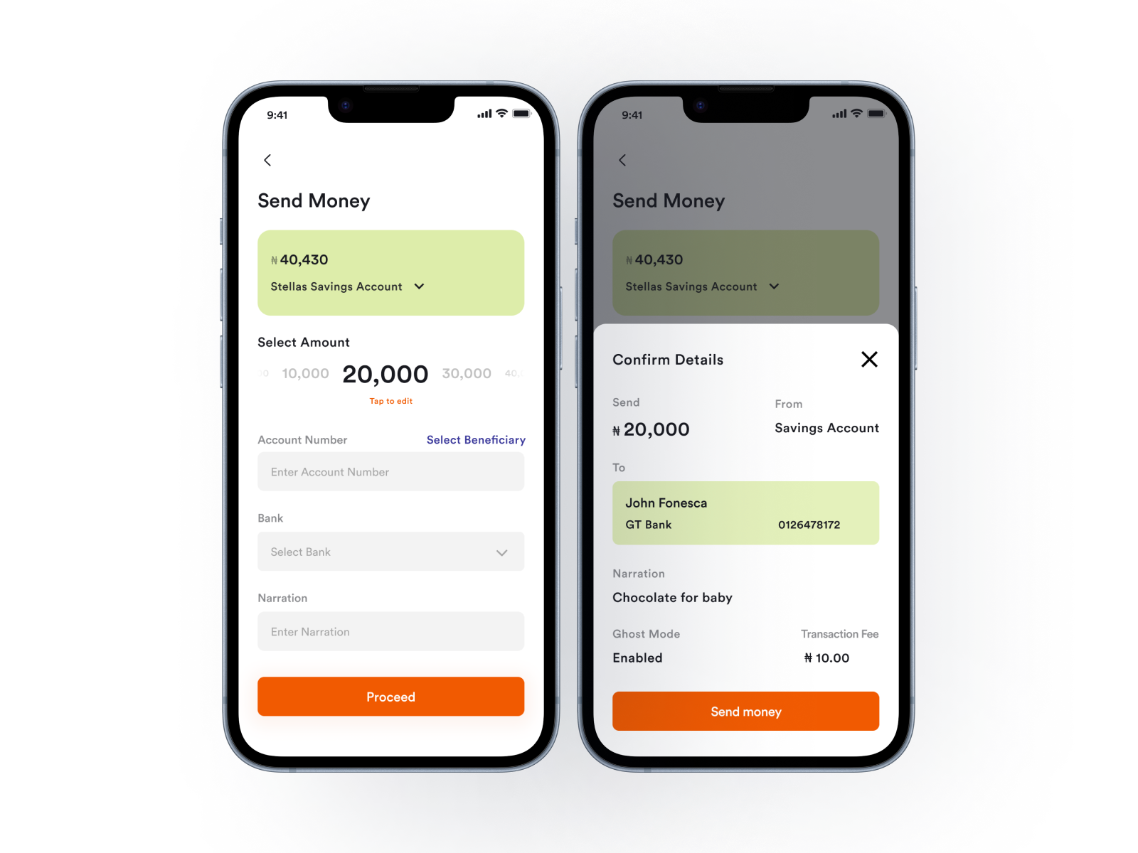
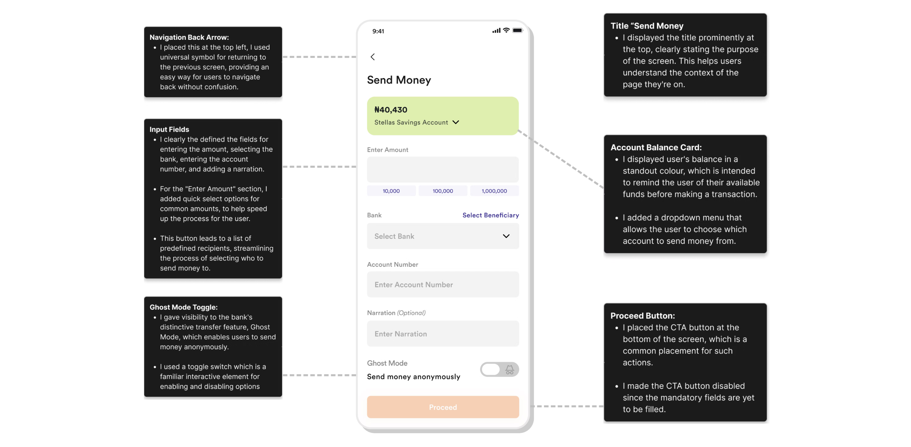
V2 shipped in 2022 and inverted the hierarchy. Instead of a slider with presets as the primary input, the new design made direct text entry the primary input, with quick-select chips (₦10,000 · ₦100,000 · ₦1,000,000) as assistive shortcuts below. Users could type any amount precisely, or tap a preset for the common cases, but the preset was no longer the default path. The 'Proceed' CTA stayed disabled until all mandatory fields were filled, and Ghost Mode (Stellas' anonymous-transfer feature) was preserved as a toggle for users who wanted it.
Accessibility-wise, we held to the same standards we apply across every flow; nothing unique to call out here. The problem wasn't an accessibility gap, it was an input-precision gap.
The design worked because the slowness now lived at the confirm step, where users wanted it, not at the input step, where they wanted speed with accuracy.
Results
Hitting the targets
Beyond the numbers, the support team noticed the shift within the first week: 'I sent the wrong amount' dropped off the top-five ticket list for the first time since launch.
What I took with me
The lesson
The slider was a lesson in mistaking the feel of a decision for the fact of one. Users don't want a design to perform care for them; they want the interaction to make the right outcome the easy one. On any high-stakes input now (money, irreversible actions, account changes), I default to friction at the confirm step, not friction at the input.
